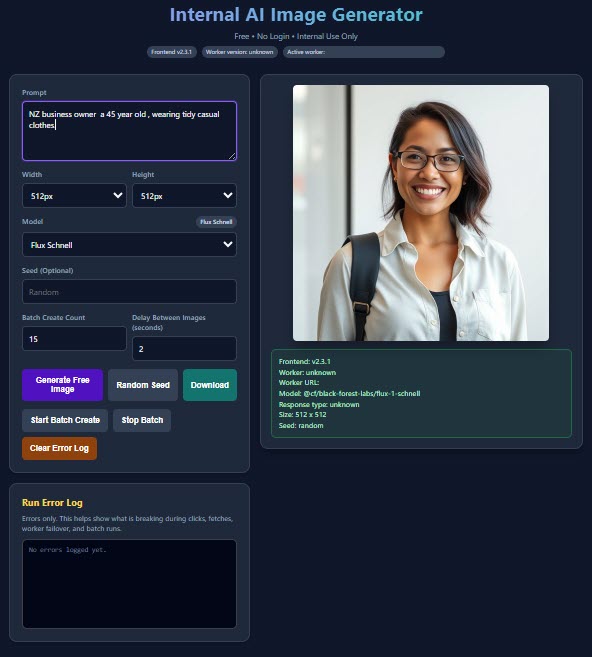
Category: AI & Automation

  • Website Trust Signals for Small Businesses: Make It Easier to Enquire with Confidence

    Website Trust Signals for Small Businesses: Make It Easier to Enquire with Confidence

    When someone visits a small business website for the first time, they are making quick practical judgements. Can I tell what this business offers? Is the information current? If I send an enquiry, will a real person respond? These questions are not solved by flashy design alone. They are answered by clear, consistent trust signals across the site.

    Trust signals are the details that make a business easier to understand and safer to contact. They should be genuine, useful and kept up to date. This guide focuses on practical improvements rather than shortcuts or exaggerated claims.

    Make the essentials easy to verify

    Start with the information a customer needs to check quickly: a business name, straightforward contact methods, the services offered and the places served. Put current phone, email or enquiry options where visitors can find them without hunting. If opening hours, appointment rules or response times are stated, make sure the team can meet them.

    Consistency matters. The details on the footer, contact page, social profiles and automated messages should not contradict one another. A customer who finds an old email address or an unanswered number may leave before they learn how capable the business is.

    Explain offers in plain language

    Clear service and product pages are trust signals in their own right. Describe what is included, what affects price or timing, and what a customer should do next. If a quote is indicative rather than final, say so. If availability changes, explain how confirmation works instead of presenting a guess as a guarantee.

    Plain information also reduces complaints. Customers are better able to make decisions when important conditions are visible before an enquiry or purchase. This is especially valuable for small teams that cannot spend every day correcting misunderstandings.

    Use proof that can be supported

    Relevant qualifications, professional experience, process details and genuine customer feedback may all help a visitor understand the business. Only publish material that is accurate, current and permitted for use. A short explanation of how work is planned or checked can be more useful than a vague statement that the business is the best.

    Do not manufacture reviews, logos, case studies, results or endorsements. Avoid ranking claims unless they can be substantiated and remain true. A customer may not need dramatic proof; they often need enough reliable information to feel comfortable taking the next step.

    Show what happens after an enquiry

    A good enquiry form tells a visitor what information is helpful and what will happen after they submit it. Keep required fields proportionate to the request. Asking for unnecessary details can feel intrusive and can create more information for the business to protect.

    If personal information is collected, make privacy information easy to reach at the point of collection. Explain the purpose in plain language and ensure the internal process matches the public wording. People should know whether they will receive a reply, a booking option or a follow-up call.

    Keep design choices working for everyone

    Trust also comes from a site that works predictably. Navigation labels should describe where they lead. Buttons should be easy to see and use on a phone. Text should be readable, and important information should not depend on a colour cue alone. Test key pages with a fresh pair of eyes and on more than one device.

    If a form fails, a link is broken or a page loads poorly, a visitor may assume the business is difficult to deal with. Regular maintenance is therefore part of customer communication, not merely a technical task.

    Use policies and boundaries thoughtfully

    Where relevant, give customers accessible information about privacy, returns, cancellations, delivery or booking changes. The right wording depends on the business model, and some matters need professional advice. The useful principle is simple: place important information where a customer can find it before it becomes a problem.

    Do not use policies to hide a harsh surprise. A fair, readable explanation combined with a contact route is more likely to support a constructive conversation if something goes wrong.

    Build a review habit

    Once a quarter, walk through the website as if you were a new customer. Check every contact route, review service descriptions, test the main call to action and compare the site with the actual customer process. Ask staff which questions they answer repeatedly. Those answers often reveal the next clarity improvement.

    Trust grows when the website says what it means, does what it says and makes it simple to ask a question.

    Frequently asked questions

    What are website trust signals?

    They are accurate details and usable experiences that help visitors understand who a business is, what it offers and how to make contact.

    Do small businesses need customer reviews on their website?

    Reviews can help when they are genuine and used with permission, but clear service information and reliable contact details are also important trust signals.

    Can I say my business is the best?

    Broad claims can be difficult to support. It is safer to explain specific, verifiable aspects of the service and let customers assess the fit.

    Why should an enquiry form be short?

    Ask only for information needed to respond. Shorter, relevant forms can be easier for visitors and reduce unnecessary personal-information handling.

    Where should privacy information appear?

    Make it easy to find and link to it near forms or other points where personal information is collected.

    How do I know whether contact details are current?

    Test every listed phone number, email address and form regularly, especially after staff, software or location changes.

    Can design affect trust?

    Yes. Readable content, clear navigation and working mobile pages help visitors complete simple tasks without uncertainty.

    How often should I review trust signals?

    Review them whenever customer processes change and schedule a periodic check of the website’s key pages and contact routes.


  • Website Speed Checklist for Small Businesses: Make Every Visit Feel Easier

    Website Speed Checklist for Small Businesses: Make Every Visit Feel Easier

    A slow website creates friction before a customer has even read a sentence. Someone may have found a local service while waiting for a bus, comparing options after work, or trying to confirm an opening time. If the page hesitates, the visitor has to decide whether the answer is worth waiting for. For a small business, that is a poor place to lose an otherwise interested customer.

    This website speed checklist for small businesses is about useful progress, not chasing a perfect score. The aim is to help pages load and respond comfortably for real people on ordinary phones and connections, while keeping the information they need easy to reach.

    Start with the pages customers use first

    Speed work is more manageable when it begins with a customer journey. Look at the homepage, key service or product pages, contact page and any booking or checkout step. These are often the pages that introduce the business or support a decision. A neglected old campaign page may matter less than the page a customer reaches from a local search result.

    Open each priority page on a phone, not only from a fast office connection. Notice the first useful thing that appears, whether buttons can be tapped promptly, and whether images jump around as the page settles. Write down the moments that feel awkward. A practical list is more valuable than an abstract technical target.

    Give images a clear job

    Large images are frequently the heaviest part of a small-business website. Good photography can explain workmanship, a place, a product or a person far more quickly than a long paragraph, but every image should earn its place. Remove decorative images that add little to the page and keep images at a sensible size for where they appear.

    Use formats and dimensions suited to the website, and avoid placing an enormous source image into a small space. Provide meaningful alternative text where an image conveys useful information. Important instructions, prices and contact details should remain in page text rather than being baked into a graphic, where they can be hard to read on a small screen.

    Keep the first screen focused

    The opening area of a page should answer a simple question: what can this business help me do next? A clear heading, brief explanation and visible next action are usually more useful than several moving banners, automatic videos or competing pop-ups. Extra features can make a first visit feel busy before the customer has established why they are there.

    Consider a homeowner looking for a repair during a lunch break. They may need to see the service area, understand the offer and find a contact option quickly. Put those essentials before longer stories, galleries or background effects. The rest of the page can still build confidence once the visitor has their bearings.

    Review add-ons with a customer question

    Plugins, tracking scripts, chat tools, font libraries and social embeds can each solve a genuine problem. They can also add work to every page visit. Review them one at a time and ask: what customer need does this meet, who maintains it, and would the page still serve its purpose without it? Remove or replace additions that have no clear owner or benefit.

    This is not an argument against useful tools. A booking tool, accessibility support or simple analytics can improve a customer experience. The point is to avoid adding several overlapping tools simply because each seemed helpful at the time. Fewer, well-understood parts are easier to keep current.

    Make mobile the everyday test

    Many visitors arrive on a phone with variable coverage, limited time and one hand free. Test menus, forms, maps and buttons at a normal mobile width. Check whether a call button works, whether a map delays the page unnecessarily, and whether a form asks for only the information needed for the next step.

    Content order matters here too. A page that asks a phone user to scroll past a large animation before revealing a phone number is making the person work for basic help. Keep the strongest information and clearest action near the start, then use headings so readers can scan rather than hunt.

    Choose reliable hosting and maintenance habits

    Website speed is not only about a page design. Server response, software updates, caching settings and the way a site has grown over time can all make a difference. Ask whoever looks after the site to explain the maintenance routine in plain language: how updates are checked, how changes are tested, and what happens if the site becomes unavailable.

    Before making a major change, keep a backup and test the critical customer paths afterward. A new feature can look fine to the person who installed it while slowing a contact form or breaking a menu for everyone else. Small, reversible changes are easier to assess than a pile of changes released together.

    Measure a little, then improve deliberately

    Use a performance check as a clue rather than a verdict. It can point to oversized images, unused code or a slow resource, but it cannot replace watching how customers use the site. Pair technical findings with actual questions from enquiries: do people say they could not find a price, struggle to submit a form, or abandon a booking?

    Make one improvement, test the priority pages again and record what changed. This creates a calm maintenance rhythm. Over time, a small business can keep a useful, credible website without turning every update into a technical project.

    Frequently asked questions

    Why does website speed matter for a small business?

    Visitors can reach information and take the next step more easily when pages load and respond without unnecessary delay.

    What should I check first?

    Start with the homepage, key service or product pages, contact page and any booking or checkout step on a phone.

    Do large images slow a website?

    They often can. Use only useful images and prepare them at suitable dimensions and formats for the place they appear.

    Should I remove every plugin or add-on?

    No. Keep tools that have a clear customer or operational purpose, but review old or overlapping additions regularly.

    How often should I test mobile pages?

    Test after meaningful changes and periodically as part of routine website maintenance.

    Can a redesign make a site slower?

    Yes. New effects, scripts and large assets can add load, so test critical customer journeys after a redesign.

    Is a performance score the whole answer?

    No. It is a useful clue, but customer tasks and real-world testing provide important context.

    What is the most useful first improvement?

    Often it is making the most important page lighter and clearer by prioritising useful content, images and one obvious next action.

    A faster website is not a finishing touch. It is a practical way to make the effort customers already make to find a business feel worthwhile.

  • Website Analytics for Small Businesses: Measure What Helps Customers

    Website Analytics for Small Businesses: Measure What Helps Customers

    Website numbers can look more precise than they really are. A dashboard may show visits, page views and sources, yet none of those figures tells a small business exactly what to change. The value of website analytics is not collecting the biggest report. It is learning enough about customer behaviour to make the site easier to use.

    For a small team, the best routine is simple: decide what a useful visit looks like, check a small set of signals regularly and connect them with real conversations. This guide to website analytics for small businesses keeps the focus on decisions rather than impressive-looking charts.

    Begin with the job the website should do

    Before opening an analytics report, describe the outcome the site is meant to support. It might be an enquiry, an appointment request, a purchase, a phone call or a visit to a service page. Different businesses need different measures. A retailer may care about product discovery and completed orders, while a local provider may care about whether potential customers find service information before getting in touch.

    Choose one or two priority outcomes rather than treating every interaction as equally important. This gives the team a useful question for each review: are people able to reach the information or action that helps them move forward?

    Learn the basic paths visitors take

    Start with the pages people reach first, the pages they visit next and the pages that lead to your preferred action. This can reveal practical patterns. If many visitors arrive on a detailed guide then continue to a relevant service page, the connection may be helping. If they land on a page with an unclear next step and leave, the content or navigation may need attention.

    Do not assume that a short visit is always bad or a long visit is always good. A visitor who finds opening hours in seconds may have had an excellent experience. Someone who spends a long time searching for a basic answer may not. Pair numbers with the purpose of each page.

    Use search terms as customer language

    Search information can show the words people use before they arrive. Those words may suggest questions that deserve clearer answers on the site. Look for recurring themes rather than chasing every unusual phrase. A local business might discover that people want a service-area answer, a price guide or a simple explanation of the process.

    Use what you learn to improve the relevant page in natural language. Do not force a list of search terms into copy. The goal is a page that answers a real question clearly, not a page that repeats a phrase until it sounds unnatural.

    Check whether important pages stay useful

    Make a short list of pages that matter most: usually the homepage, key service or product pages, the contact route and a few frequently visited articles. Review them for accurate information, working links, readable headings and a clear next step. Analytics can help identify pages that attract attention, but a manual check ensures the page still deserves it.

    Compare changes with what the business knows from daily work. If a page receives more visits after an update but enquiries become less suitable, the content may be attracting the wrong expectation. If staff stop answering the same introductory question, a clearer page may be saving time even if the headline numbers barely move.

    Keep privacy and consent in view

    Measurement tools can involve personal information, cookies or other identifiers. New Zealand businesses should understand what information their chosen tools collect, why it is needed and how people are told about it. A clear privacy statement and appropriate choices at the point of collection are practical starting points. The details depend on the tool and situation, so seek specialist advice where necessary.

    Collecting less can be a strength. A small business does not need every possible data point to improve a website. Choose tools and settings that support the decisions you actually plan to make, then keep records and explanations current.

    Make a manageable review rhythm

    A monthly review is often enough for a small site, with extra checks after a campaign, major update or seasonal change. Put the review on the calendar and use the same questions each time: What did visitors come to do? Which pages helped? Where did they appear to get stuck? What is one change worth testing?

    Record the answer in a simple note. Over several months, this becomes more useful than a collection of screenshots because it shows what was changed and why. It also helps a new staff member understand the site’s history without relying on memory.

    Test one improvement at a time

    When a page appears confusing, start with a practical hypothesis. Perhaps the page needs a more specific heading, a clearer action, a better link to related information or a shorter form. Change one significant feature, note the date and observe what happens over a reasonable period. This makes it easier to learn than changing the entire page and guessing which part mattered.

    Be cautious about small shifts, especially on a low-traffic site. A handful of visits can create a dramatic percentage without proving a lasting trend. Use the figures as evidence to discuss alongside customer feedback, calls and actual enquiries.

    Share insight with the people who answer customers

    The person replying to enquiries often knows more about website gaps than any dashboard. Invite them to flag recurring questions, pages that customers misunderstand and terms people use in conversation. Compare those notes with the pages visitors use. This creates a practical loop: the website prepares people better, and customer questions show what to improve next.

    Analytics are most useful when they help a small business notice a customer question and make one practical improvement. Keep the measurement light, respect people’s information and let real customer needs guide the next decision. That is how a website becomes more helpful over time.

    Frequently asked questions

    What are website analytics?

    They are information about how people find and use a website, such as the pages they visit and the actions they take.

    Which website metrics should a small business track?

    Track a small number linked to your goal, such as visits to key pages, completed enquiries or purchases, and the paths visitors take before those actions.

    How often should I review website analytics?

    A monthly review is a practical starting point for many small businesses, with extra reviews after important site changes or promotions.

    Does more website traffic always mean better results?

    No. Useful traffic is traffic from people who can find relevant information and take an appropriate next step.

    What can analytics tell me about my customers?

    They can suggest which pages and topics draw interest, but they work best when compared with real enquiries and customer feedback.

    Should I change my website every time a number changes?

    No. Look for patterns, consider the purpose of the page and test one meaningful improvement at a time.

    Do I need to consider privacy when using analytics?

    Yes. Understand what your tools collect, explain relevant collection clearly and seek appropriate advice for your circumstances.

    Can a small business use analytics without being technical?

    Yes. Start with a few business questions and use simple reports to support practical improvements rather than trying to monitor every available number.

  • Website Navigation for Small Businesses: Help Customers Find the Next Step

    Website Navigation for Small Businesses: Help Customers Find the Next Step

    A small business website can have excellent services, clear writing and attractive photographs, yet still leave a visitor unsure where to go next. It happens when the navigation is organised around the business rather than the customer. Someone who arrives with a practical question does not want to decode internal labels. They want a quick path to an answer, a service or a way to get in touch.

    Website navigation for small businesses is not mainly about clever menus. It is about making the next sensible choice obvious. A local customer may be checking whether you offer a particular service. A returning customer may need your contact details. A visitor comparing options may want to know how your process works. When each of those needs has a clear route, the website feels calmer and more trustworthy.

    Start with the visitor’s first question

    Before changing a menu, list the questions people ask before they enquire. A trades business may hear “What work do you do?” and “Which areas do you cover?” A professional service may hear “Is this suitable for my situation?” and “How do I begin?” A shop may hear “What is available?” and “How does delivery work?” Those questions are better starting points than a list of internal departments.

    Put the most important answers where they are easy to find. The main menu should normally lead to core services or products, a short explanation of the business, useful guidance where it exists and a contact route. A visitor should not need to search several unrelated pages to understand the basic offer.

    Keep the main menu short and descriptive

    Every extra choice asks a visitor to pause. That does not mean a website must hide useful information; it means the first level of navigation should be purposeful. Use labels that say what is behind the link. “Services”, “Pricing”, “About”, “Resources” and “Contact” are usually easier to understand than slogans or inside jokes.

    Imagine a mobile screen, where a large menu can feel like a long to-do list. If two items serve the same purpose, combine them. If an item matters only to a small group of visitors, consider placing it within the relevant service page instead of the main menu. The goal is not the fewest possible links. It is the fewest decisions needed to reach an important answer.

    Give important pages a clear home

    A useful page should have one obvious place in the site structure. For example, a page explaining a particular service might sit beneath a general services overview. A guide that helps people prepare for an appointment might sit within a resource area and be linked from the relevant service page. This gives visitors a sense of where they are and a way back if they need it.

    Simple hierarchy also helps a small team maintain the site. When new content is added, ask which customer question it answers and where someone would expect to find it. That prevents the site from becoming a collection of useful but disconnected pages.

    Make service choices easy to compare

    When a business offers several services, visitors often need help recognising the difference. Give each major service a direct name and a short description. A brief overview page can introduce the options, while individual pages provide the details, limits and next steps. Avoid forcing someone to read a long general page before they can locate the service that fits.

    Use links in the page body as well as the menu. After explaining a common issue, point to the page that covers it. After describing a process, point to the contact or booking step. These links are not a substitute for navigation; they are gentle signposts for people who are already reading.

    Design for the smaller screen first

    Many visitors will meet your website on a phone, often between other tasks. Test the menu there. Can you tap each item without difficulty? Does the label still make sense when it appears on its own? Is the contact route visible without opening several layers? A desktop layout can hide problems that become obvious on a narrow screen.

    Also check what happens when text is enlarged. Clear labels, sensible spacing and a menu that works with a keyboard make the site easier to use for more people. Accessibility is not an optional finishing touch; it supports the same basic aim as good navigation: helping a person complete a task without unnecessary friction.

    Use calls to action as part of the route

    A menu gets a visitor to the right page, but the page still needs to show what happens next. A clear call to action can invite someone to request a quote, ask a question, check availability or read a related guide. It should match the visitor’s level of readiness. Someone reading a first-time guide may prefer to learn more, while someone reviewing a service page may be ready to make contact.

    Describe the action plainly. “Tell us what you need help with” is more useful than a vague prompt. If a response takes time or an appointment needs information, explain that briefly. Clear expectations make a navigation path feel complete rather than abrupt.

    Watch for dead ends and duplicate routes

    Review key pages as if you were a new visitor. After reading an article, can you find a relevant service? After reading a service page, can you make contact? After opening an old page from a search result, can you understand how it fits into the current site? A dead end does not always mean a broken link. It can be a page that answers one question but offers no sensible continuation.

    Duplicate routes can be confusing too. If several menu items lead to almost the same information, people may wonder whether they are missing something. Combine pages when the audience, question and action are genuinely the same. Keep separate pages when the visitor needs a different answer.

    Use enquiries to improve the structure

    Navigation is never finished because customer questions change. Keep a simple list of questions received by phone, email or forms. If the same question appears repeatedly, check whether the answer is difficult to find or unclear. A small adjustment to a menu label, heading or internal link can remove a hurdle for future visitors.

    Review website data carefully as supporting evidence, not as a verdict on its own. A frequently visited page may be useful, confusing or both. Combine what the numbers suggest with what customers and staff are actually hearing. The purpose is to help people find information, not to chase a single measure.

    Conclusion

    Navigation works best when it follows the questions a visitor asks naturally. Keep the main menu short, name pages clearly, give each important page a logical home and make the next action easy to see. A small business does not need a complicated website to be helpful. It needs a structure that lets customers move from curiosity to clarity with confidence.

    Frequently asked questions

    What should a small business website menu include?

    Include the pages customers use most, such as core services or products, an about page, useful resources where relevant and a clear contact route.

    How many main menu items should I use?

    Use only as many as visitors need to reach important information easily. A short, descriptive menu is often easier to scan than a long list.

    Should every service have its own page?

    Separate pages help when services answer different customer questions or require different next steps. Closely related offerings can sometimes sit together.

    Why is mobile navigation important?

    Many visitors use phones. Testing the menu on a smaller screen helps ensure labels, links and contact actions remain easy to use.

    What makes a menu label clear?

    A clear label describes the content behind it in everyday language. Avoid vague slogans or terms only your team understands.

    How can I find navigation problems?

    Test common visitor tasks, review recurring enquiries and look for pages that leave readers without a relevant next step.

    Do internal links help navigation?

    Yes. Relevant links within page content can guide readers to supporting details, related services or an appropriate contact action.

    How often should I review website navigation?

    Review it when services, customer questions or site content change, and schedule a regular check of important paths through the site.

  • Website Maintenance Checklist for Small Businesses: Keep Your Site Useful and Current

    Website Maintenance Checklist for Small Businesses: Keep Your Site Useful and Current

    A website does not need constant reinvention to stay valuable. It does need attention. Opening hours change, a service evolves, staff move on, a form stops delivering messages, or an old promotion quietly becomes the first thing a customer sees. Small issues accumulate until the site begins to create work for the business instead of reducing it.

    A realistic website maintenance routine is a way to prevent that drift. The aim is not to spend every week polishing pages. It is to give one person a repeatable checklist, a little time and a clear line between simple housekeeping and work that needs specialist support. This guide is practical general information for New Zealand small businesses, not a substitute for advice tailored to a complex website or a serious incident.

    Give the routine an owner and a rhythm

    Maintenance works best when it belongs to a named person, even if that person asks a developer or agency for help. Choose a monthly time to review the essentials and a longer quarterly review for bigger questions. Put it in a shared calendar. A task that has no owner and no date tends to wait until a customer points out a problem.

    Keep a short log of what was checked, what changed and what still needs attention. It can be a simple document with the date, the page or account involved and the next action. This record is helpful when different people share responsibility, and it makes recurring issues easier to spot. Good maintenance is less about remembering everything than making the next check easy to begin.

    Read the website like a first-time customer

    Start with the pages that matter most: the home page, key services, contact page, booking or enquiry form, opening hours and any current offer. Read the first screen on a phone and ask a few basic questions. Is it clear what the business does? Is the location or service area accurate? Can a visitor see how to make contact? Does every urgent message still apply?

    Then test the obvious paths. Use the menu, click important buttons and submit a test enquiry if the process allows it. Check that the message reaches the right inbox and that the automatic reply, if any, makes sense. It is surprising how often a small change to an email address or form setting leaves a business believing leads are quiet when they are simply going elsewhere.

    Keep facts and content current

    Review contact details, staff profiles, services, prices where they are displayed, delivery information, event dates and policies. Remove expired promotions rather than leaving customers to guess whether they still apply. If you publish articles, revisit older pieces that attract attention and correct information that has changed. Adding new material is useful when it answers a genuine customer question; it does not need to happen merely to fill a schedule.

    Look for consistency across the site. A business may update a home-page phone number and overlook the footer, a service page or a downloadable document. Search the site for old names, outdated locations and previous offers. Small corrections build credibility because customers notice when a business has taken care of the details they need.

    Review access before it becomes a problem

    Check who can sign in to the website, hosting, domain and related services. Individual accounts are easier to manage than shared credentials. Remove access that is no longer needed and make sure a current business representative can reach the accounts that matter. When a contractor finishes or a staff role changes, access review should be part of the offboarding conversation.

    Use long, unique passwords and enable an additional sign-in check where available, especially for accounts that control the website or business email. A reputable password manager can make this practical without encouraging people to reuse passwords. Do not share account details casually in messages or documents; agree on a secure handover method with the people who need access.

    Confirm updates, backups and recovery

    Website platforms, extensions and server software may need regular updates. Agree with your technical contact on who monitors these and how urgent changes are handled. Before a larger update, ensure there is a current backup and a reasonable recovery plan. Unused extensions and themes should be reviewed too, because every unnecessary component becomes something else to maintain.

    A backup is reassuring only when it can be used. Confirm what is backed up, how often it happens, where the copy is held and who can restore it. Periodically ask for a recovery test in a safe environment. The goal is not to create drama; it is to learn the steps while there is time to solve a missing detail calmly.

    Watch for customer experience signals

    Pay attention to repeated questions, abandoned forms, complaints about finding information and feedback from the team answering calls. These are often better clues than a generic wish to “improve the website”. If customers repeatedly ask whether you serve their area, make that answer easier to see. If they are unsure what happens after an enquiry, explain the first step.

    Review basic site information with context. A sudden drop in enquiries may relate to seasonality, an operational change or a technical fault; do not jump to one conclusion from a single number. Compare with what staff are hearing and investigate simple causes first: broken links, forms, outdated information or a page that is difficult to use on a phone.

    Make privacy and accessibility ordinary checks

    When a page or form changes, ask whether it collects only the information needed. Make sure messages are sent to an appropriate place and that your privacy explanation matches what actually happens next. If a new service provider handles enquiries, bookings or payments, pause to understand the change before publishing it.

    For accessibility, use headings that describe the content, text that remains readable, clear labels for forms and alternative text for informative images. Test keyboard use where possible and avoid hiding important instructions only in colour or an image. These habits make the site more usable for more people and tend to improve clarity for everyone.

    Know when to ask for help

    Some tasks are routine; others deserve expert support. Ask a suitable technical professional about persistent errors, suspicious activity, performance issues, complicated updates or recovery work. Seek appropriate privacy, legal or accessibility advice when the website handles sensitive information or the consequences of getting it wrong are significant. A maintenance checklist is a prompt for sensible action, not a reason to take risks outside your expertise.

    The most effective routine is modest enough to continue. A focused monthly check, a clear record and prompt escalation for unusual issues will keep a small-business website more accurate, trustworthy and useful than an occasional scramble ever could.

    Frequently asked questions

    How often should a small business check its website?

    A monthly check is a practical starting point, with a deeper review every few months and whenever the business changes.

    What pages should be checked first?

    Start with the home page, core services, contact details, forms, opening hours and any current promotions or events.

    Why should we test our own contact form?

    Testing confirms that enquiries still reach the right inbox and that the customer journey works as intended.

    Who should own website maintenance?

    Name a business representative to coordinate the routine, even when a technical provider completes specialist work.

    Do we need to update every part of the site each month?

    No. Review the important customer paths and current facts, then schedule larger improvements when evidence supports them.

    What should a website backup include?

    It should cover the files, database, uploaded material and relevant configuration needed to restore the site.

    When should access be reviewed?

    Review access routinely and whenever a staff member leaves, a contractor finishes, or responsibilities change.

    Can website maintenance improve customer trust?

    Yes. Accurate details, working forms and clear information show customers that the business is active and attentive.

  • Bulk AI image Generation Tool

    Bulk AI image Generation Tool

    Scaling Visual Content Without Slowing Down Your Marketing

    Visual content is no longer optional—it’s essential.

    From websites and social media to ads and product listings, images play a critical role in capturing attention, communicating value, and driving engagement. But creating high-quality visuals consistently can be time-consuming, expensive, and difficult to scale.

    This is where AI bulk image generation becomes a powerful solution.

    Instead of creating visuals one at a time, you can generate large volumes of images quickly, consistently, and strategically—helping your business stay visible and competitive.

    What Is AI Bulk Image Generation?

    AI bulk image generation is the process of creating multiple images at scale using intelligent systems and structured prompts.

    It allows you to:

    Generate batches of images in one workflow
    Maintain consistent styles and themes
    Create visuals for multiple platforms
    Produce variations quickly

    Rather than designing each image manually, you build a system that produces visual content efficiently.

    Why Visual Content Matters More Than Ever

    Before understanding the benefits of bulk generation, it’s important to recognise the role visuals play in your marketing.

    1. Images Capture Attention

    People process visuals faster than text. Strong imagery stops users from scrolling.

    1. Visuals Improve Engagement

    Content with images is more likely to be interacted with and remembered.

    1. Consistency Builds Brand Identity

    A consistent visual style helps your brand feel recognisable and professional.

    1. Every Platform Requires Visual Content

    Websites, social media, ads, and emails all rely heavily on imagery.

    Without a steady flow of visuals, your marketing can feel incomplete.

    The Challenge of Traditional Image Creation

    Creating visuals manually presents several challenges.

    Time-Consuming:
    Designing each image individually takes significant effort.

    Inconsistent Style:
    Without a system, visuals can feel mismatched.

    Limited Output:
    Producing large volumes quickly is difficult.

    High Costs:
    Custom design work can become expensive over time.

    AI bulk image generation solves these problems.

    How AI Bulk Image Generation Works

    The process combines planning with automation.

    Prompt Creation

    You define the style, subject, and purpose of your images.

    Batch Generation

    Multiple images are created in one sequence.

    Variation Control

    You can generate different versions of the same concept.

    Selection and Refinement

    Choose the best outputs and refine them as needed.

    This creates a scalable and repeatable workflow.

    Key Benefits of AI Bulk Image Generation

    When used correctly, it offers significant advantages.

    High Volume Output

    Create dozens or even hundreds of images quickly.

    Consistent Visual Style

    Maintain a unified look across all content.

    Faster Content Production

    Reduce the time required to create visuals.

    Flexibility

    Generate images for different purposes and platforms.

    Scalable Marketing

    Support growing content needs without increasing workload.

    Common Use Cases for Bulk Image Generation

    AI-generated images can be used across many areas of your business.

    Social Media Content

    Create consistent visuals for posts and campaigns.

    Website Graphics

    Enhance pages with relevant and engaging imagery.

    Advertising Creatives

    Generate multiple variations for testing and optimisation.

    Product Visuals

    Create supporting images for listings and promotions.

    Content Marketing

    Pair visuals with blogs and articles to improve engagement.

    Common Mistakes to Avoid

    While powerful, bulk image generation needs to be used strategically.

    Lack of Planning:
    Without clear direction, images can feel random.

    Inconsistent Prompts:
    Poorly structured prompts lead to inconsistent results.

    Overproduction Without Purpose:
    Generating images without a clear use reduces effectiveness.

    Ignoring Brand Identity:
    Visuals should align with your overall style.

    Skipping Review:
    Not all generated images will be suitable—selection is important.

    Avoiding these mistakes ensures better outcomes.

    How to Use AI Image Generation Effectively

    To get the most value, combine automation with strategy.

    Define Your Visual Style

    Establish a consistent look and feel for your brand.

    Plan Your Content Needs

    Know what types of images you need and why.

    Use Structured Prompts

    Clear instructions lead to better results.

    Generate in Batches

    Create multiple images in one session.

    Select and Refine

    Choose the best outputs and improve them if needed.

    Align with Your Content

    Ensure visuals support your messaging.

    Turning Visual Creation into a System

    AI bulk image generation allows you to build a repeatable process.

    Instead of:

    Creating visuals randomly
    Struggling with consistency
    Running out of content

    You create a system that:

    Produces images regularly
    Maintains a consistent style
    Supports your marketing strategy

    This creates efficiency and momentum.

    The Role of Visual Content in Growth

    As your business grows, your content needs increase.

    More campaigns, more platforms, and more engagement all require more visuals.

    AI bulk image generation ensures you can:

    Keep up with demand
    Maintain quality
    Scale your marketing

    Without it, visual content can become a bottleneck.

    The Long-Term Value of AI Image Systems

    Over time, the benefits become even more noticeable.

    You gain:

    A large library of visual assets
    Consistent branding
    Faster content production
    Improved engagement

    Instead of reacting to content needs, you stay ahead of them.

    Why Professional Setup Matters

    While AI tools are accessible, professional setup ensures your system delivers real results.

    This includes:

    Defining visual styles
    Structuring prompts
    Creating workflows
    Ensuring consistency

    Instead of random outputs, you get a system designed to support your marketing.

    Frequently Asked Questions

    1. What is AI bulk image generation?
      It is the process of creating multiple images at scale using intelligent systems.
    2. Why is visual content important?
      It improves engagement, captures attention, and supports your messaging.
    3. Can AI generate high-quality images?
      Yes, when guided with clear structure and prompts.
    4. What can these images be used for?
      Social media, websites, ads, and content marketing.
    5. How do I maintain consistency?
      By using structured prompts and a defined visual style.
    6. Do I need to review generated images?
      Yes, selecting the best outputs ensures quality.
    7. Is bulk image generation suitable for small businesses?
      Yes, it helps scale content without increasing workload.
    8. Is AI image generation a long-term solution?
      Yes, it supports ongoing marketing and growth.
  • AI Bulk Content Creation

    AI Bulk Content Creation

    Scaling Your Marketing Output Without Losing Quality

    Content drives visibility, engagement, and growth.

    But for most businesses, the challenge isn’t understanding the importance of content—it’s keeping up with the demand. Blogs, emails, landing pages, product descriptions, and social media posts all require time, consistency, and structure.

    Creating content one piece at a time can quickly become overwhelming.

    This is where AI bulk content creation changes the game.

    Instead of producing content slowly and inconsistently, you can generate large volumes of structured, high-quality content efficiently—while maintaining clarity and purpose.

    What Is AI Bulk Content Creation?

    AI bulk content creation is the process of generating multiple pieces of content at scale using structured systems and intelligent automation.

    It involves:

    Producing multiple blog posts at once
    Creating batches of social media content
    Generating email sequences
    Building large volumes of product descriptions
    Developing landing pages in a structured format

    The goal is not just speed—it’s consistency and scalability.

    Why Businesses Need Bulk Content Creation

    Modern marketing requires ongoing content.

    1. Consistency Drives Results

    Publishing regularly keeps your business visible and relevant.

    1. More Content Increases Reach

    The more content you create, the more opportunities you have to be discovered.

    1. Time Is a Limiting Factor

    Creating content manually at scale is time-consuming.

    1. Multiple Channels Require Content

    You need content for:

    Websites
    Emails
    Social platforms

    1. Growth Requires Systems

    Without a structured approach, content creation becomes inconsistent.

    AI bulk content creation addresses these challenges.

    How AI Bulk Content Creation Works

    The process combines strategy with automation.

    Content Planning

    Topics and themes are defined based on your goals.

    Structured Generation

    Content is created using consistent formats and frameworks.

    Batch Production

    Multiple pieces of content are generated at once.

    Refinement and Optimisation

    Content is reviewed and adjusted to ensure quality.

    This creates a streamlined and efficient workflow.

    Key Benefits of AI Bulk Content Creation

    When implemented correctly, bulk content creation delivers significant advantages.

    Increased Output

    You can produce far more content in less time.

    Consistency Across Channels

    Your messaging remains aligned and structured.

    Reduced Workload

    Automation reduces the time required for content creation.

    Improved Organisation

    Content is planned and produced systematically.

    Scalable Marketing

    Your content strategy can grow alongside your business.

    Common Mistakes to Avoid

    While bulk content creation is powerful, it must be used correctly.

    Prioritising Quantity Over Quality:
    Content should still provide value and clarity.

    Lack of Strategy:
    Without direction, content can become unfocused.

    Inconsistent Tone:
    Your brand voice should remain consistent.

    Skipping Review:
    Editing ensures accuracy and relevance.

    Over-Automation:
    Human input is still important for refinement.

    Avoiding these mistakes ensures better results.

    How Bulk Content Creation Supports Your Marketing

    Bulk content creation is not just about producing more—it’s about improving your overall strategy.

    Stronger Online Presence

    Regular content increases visibility and engagement.

    Better Audience Connection

    Consistent messaging builds familiarity and trust.

    More Opportunities for Conversion

    Each piece of content is a chance to attract and convert users.

    Efficient Use of Resources

    You achieve more without increasing workload.

    Turning Content Creation into a System

    One of the biggest advantages of AI bulk content creation is that it transforms your process into a system.

    Instead of:

    Creating content randomly
    Struggling with consistency
    Reacting to content needs

    You create a structured approach that:

    Plans content in advance
    Produces content in batches
    Maintains consistency

    This creates momentum and stability.

    Practical Tips for Effective Bulk Content Creation

    To maximise results, follow these strategies.

    Start with a Content Plan:
    Define your topics and goals.

    Use Structured Formats:
    Maintain consistency across all content.

    Focus on Value:
    Ensure each piece of content is useful and relevant.

    Maintain Your Brand Voice:
    Keep your tone consistent.

    Batch Your Work:
    Create multiple pieces at once.

    Review and Refine:
    Edit content before publishing.

    AI Bulk Content as a Growth Strategy

    Bulk content creation is not just a tactic—it’s a growth strategy.

    It allows you to:

    Expand your reach
    Maintain consistent visibility
    Support multiple marketing channels
    Scale your efforts efficiently

    This creates a strong foundation for long-term success.

    The Long-Term Value of AI Bulk Content Creation

    Over time, the benefits compound.

    You gain:

    A large library of content
    Increased visibility
    Better engagement
    A scalable marketing system

    Instead of struggling to keep up, you build a system that works continuously.

    Why Professional Setup Matters

    While AI tools are widely available, professional setup ensures your content strategy is effective.

    This includes:

    Strategic planning
    Structured workflows
    Consistent messaging
    Ongoing optimisation

    Instead of random output, you get a system designed to deliver results.

    Frequently Asked Questions

    1. What is AI bulk content creation?
      It is the process of generating large volumes of content using structured systems.
    2. Why is bulk content important?
      It helps maintain consistency and increase visibility.
    3. Can AI create high-quality content?
      Yes, when combined with strategy and refinement.
    4. What types of content can be created?
      Blogs, emails, social posts, and product descriptions.
    5. Do I still need to edit the content?
      Yes, editing ensures accuracy and quality.
    6. Is bulk content suitable for small businesses?
      Yes, it helps scale marketing efforts efficiently.
    7. How do I maintain consistency?
      By using structured formats and clear guidelines.
    8. Is AI bulk content a long-term solution?
      Yes, it supports ongoing growth and marketing success.