
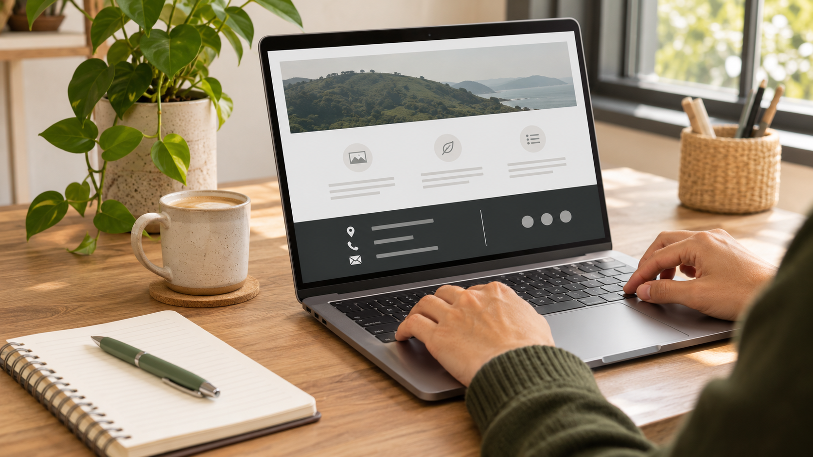
The footer is the section at the bottom of a website page, but it is not an afterthought. A visitor often reaches it after scanning a page, comparing options or looking for a detail that was not in the main content. For a small business, a clear footer can provide the reassurance and direction that turns a nearly-finished visit into a useful next step.
The best footer is not a crowded storage cupboard for every link the team has ever created. It is a consistent, practical navigation area that helps people find important information without making them work harder. This checklist explains what to include, what to leave out and how to keep the footer honest as the business changes.
Decide what a visitor needs at the end of a page
Think about why someone has reached the footer. They may have read a service page and now want to enquire. They may be checking whether the business serves their area, looking for opening hours or trying to find a policy before they proceed. These needs should guide the layout more than a desire to display every possible menu item.
Choose a small number of high-value destinations. For many businesses, that includes contact details, a contact page, key services, an about page and essential policy information. A retailer may need delivery and return information. A location-based service may need a clear service-area page. Start with the questions customers actually ask rather than copying another site’s structure.
Keep contact details accurate and usable
If a phone number, email address or physical address appears in the footer, it must be current. Check that phone numbers can be tapped on a phone, email links open correctly and opening hours match the business’s real availability. Do not list a monitored address if messages are routinely missed; a simple contact route that receives a reliable response is more useful.
Where the business works by appointment, travels to customers or has changing hours, say so plainly. Avoid presenting an address in a way that implies a walk-in location if it is not one. Clarity saves customers a wasted trip and helps the team receive better enquiries.
Use navigation as a helpful shortcut
A footer can repeat a concise version of the main navigation, especially on long pages. Group links under clear labels such as services, help and contact. Keep labels familiar. A visitor looking for a way to get in touch should not have to guess whether “connect”, “start here” or “our world” means contact.
Remove links that lead to outdated pages, empty sections or content with no public purpose. Too many choices can make an otherwise simple footer harder to scan. If a link exists only because it was useful during the website build, it probably does not need to be a permanent customer-facing option.
Give policies a sensible home
Policy links in the footer can help visitors find information about privacy, terms, returns, booking changes or other relevant conditions. The exact list depends on the business and its activities. The important part is that the linked page is written for real readers, reflects current practice and is not used to hide information that should appear earlier in the customer journey.
Do not treat a generic footer statement as a substitute for professional advice. Legal, financial, health and similar obligations depend on the situation. If the business is uncertain about what it must disclose, seek suitable advice and then present the resulting information in language customers can understand.
Support accessibility and readable design
Footers often use smaller text and darker backgrounds, which can make them difficult to read if contrast is weak. View the footer on a phone and in ordinary lighting. Can a visitor distinguish headings, links and supporting text without straining? Can they move through the links using a keyboard if they do not use a mouse?
Use descriptive link text where possible. “Contact us” tells a visitor what will happen more clearly than “click here”. Avoid relying on colour alone to show which items are links. These choices make the footer easier for a wider range of people and reduce friction for everyone.
Make social and subscription links deliberate
Only include a link to a public profile that is active, accurate and genuinely useful to customers. A neglected page can create doubt rather than trust. If the footer invites visitors to subscribe, explain what they can expect and make the sign-up process voluntary and clear. A vague invitation to “join” gives a reader little reason to share an email address.
Check who receives subscription details, where they are stored and how a person can change their mind later. The footer is a good place for a route to preferences or contact information, but it should not pressure visitors into sharing more than they want to provide.
Review the footer after business changes
Footers are copied across a website, so one outdated detail can appear on every page. Add footer review to the checklist whenever the business changes address, phone number, opening hours, legal structure, services or customer process. Test it after any website redesign too; templates can accidentally remove links or move information into a less visible place.
A good footer does not compete with the page above it; it quietly helps a visitor finish their task. With a few accurate links, usable contact details and readable design, it can make every page feel more complete and dependable.
Frequently asked questions
What should a small-business website footer include?
Include a concise route to contact details, important services or pages, and current policy information that is relevant to customers.
Should I put my address in the footer?
Include an address when it helps customers and accurately represents how the business operates; explain clearly if visits are by appointment only.
How many links belong in a footer?
Use only the links that help visitors complete common tasks. A short, organised list is usually easier to use than a long directory.
Can I repeat the main navigation in the footer?
Yes, a concise repeat can help people at the end of a long page, provided the labels remain clear and relevant.
Why are footer contact details important?
Visitors often look at the bottom of a page for a final way to contact the business, so the details need to be current and usable.
Should a footer contain privacy information?
It can link to a clear privacy page, but the business should also explain information collection where customers actually provide their details.
Do social links belong in every footer?
Only add public profiles that are active and useful; an outdated or unmanaged link may undermine confidence.
How often should I check a website footer?
Review it whenever core business details or policies change, and include it in regular website and redesign checks.
Leave a Reply